Most AI generated city posters look like AI generated city posters. The composition drifts, the typography breaks, the colors saturate past the point of taste, and the cultural details get invented by the model in ways that feel wrong to anyone who knows the place. The output is noise, and the noise is the same whether you use Midjourney, DALL·E, or any of the alternatives.
AI Traveler K, a Threads creator, has released a Beams inspired minimalist travel poster prompt that fixes this, and the design system approach is what makes it work. The prompt is not a string of adjectives. It is a strict design system with layout rules, typography rules, color constraints, and composition rules, and the output is the cleanest premium editorial poster aesthetic currently reproducible in AI image generation.
The prompt is built for AI artists, prompt designers, branding designers, and marketers, and it solves the most expensive problem in AI design work, which is that consistency at premium quality is the actual blocker.

The Problem with AI City Posters Right Now
Every AI image generator can produce a city skyline. None of them produce a Beams style editorial poster on the first try, because the prompt is doing too little work and the model is doing too much interpretation. The failure modes are predictable.
- Generic Composition: Centered skyline, gradient sky, foreground text. The model defaults to stock image composition, and stock image composition is the opposite of editorial design.
- Broken Typography: Letters scrambled, kerning off, font choice inconsistent across runs. The model treats text as decoration instead of as a structural element.
- Oversaturated Color: “Vibrant” and “beautiful” trigger maximum saturation. The result looks like a tourism campaign from 2014, not like a premium editorial poster.
- Invented Cultural Details: Landmarks in the wrong place, architectural styles that do not exist in the target city, signage in languages the city does not use. The model hallucinates because the prompt did not anchor the cultural specifics.
- No System Across a Set: One poster looks fine. Three posters look unrelated. The set does not feel like a series because nothing in the prompt enforces series level consistency.
The result is that AI city posters are unusable for any real brand or campaign work. They are mood board material, and that is where most AI design output stops.

What the Beams-Inspired Prompt Actually Controls
The AI Traveler K prompt is structured as a design system, not as a description. It treats the poster as a system of constrained variables, and the constraints are what produce the premium look.
- Layout Rules: The template specifies the grid, the negative space, the hierarchy of subject to text, and the placement of supporting elements. Composition is not left to the model.
- Typography Rules: Font family, weight, sizing, kerning, and placement are all specified. The text layer is treated as a structural element, not as decoration. This is the layer that most prompts skip.
- Color Constraints: The palette is muted, desaturated, and constrained. The model cannot drift into maximum saturation, and the result is the Beams style editorial look that premium brands use.
- Composition Rules: Framing, subject placement, foreground background relationship, and depth are all specified. The model is not allowed to invent a different framing on every run.
The combination is what produces the clean, minimalist, premium poster look that other prompts cannot reproduce, and the reason it works is that the prompt does not leave the important variables to the model’s interpretation.
Why This Matters for Designers and Marketers
The promise of AI image generation for design teams has always been volume and speed. The reality has been that volume comes at the cost of quality, and speed comes at the cost of consistency. A structured design system prompt changes the economics of the whole workflow.
- Production Ready Output: The poster looks like editorial design on the first run. It does not need a human to fix the typography or rebalance the colors before it can ship.
- Consistent Across a City Series: Ten city posters generated from the same prompt template look like a set. The brand identity holds across the campaign.
- On Brand for Premium Positioning: The Beams inspired aesthetic is the visual language of premium lifestyle brands. The template is plug and play for any brand targeting that positioning.
- Usable for Real Campaign Work: A poster with controlled typography, color, and layout is not an AI image. It is a design asset. The template produces the latter.
The shift is from “AI helps me generate ideas” to “AI ships design assets.” That is the line the template crosses.
Why Prompt Engineers Should Study This
For prompt engineers, the AI Traveler K template is a reference example of how to control a generative model at the level of design system output, not just image content. Most prompt engineering resources stop at subject and style. This template goes five layers deeper, and the pattern generalizes.
- Design System Over Description: The prompt is a system with rules, not a description with adjectives. The difference in output quality is enormous.
- Constraint as Aesthetic: The constraints on color, typography, and layout are what produce the Beams look. Removing the constraints removes the aesthetic. Constraint is the feature.
- Cultural Anchoring: Naming the cultural specifics, the city landmarks, the regional palette, the architectural style, is what prevents the model from hallucinating details that feel wrong.
- Series Consistency: The template is reusable across cities because the rules are stable and only the variables change. This is what makes set level work possible.
Any aesthetic that needs consistency across a set can be packaged as a structured template with named variables and constraints. Travel posters are the worked example. The pattern applies to album covers, editorial illustrations, brand mascots, product mockups, and more.
What People are Saying
The Beams inspired prompt has been picked up across the Threads design community, and the reaction signals that it solves a real workflow problem for people who actually need to ship design work.
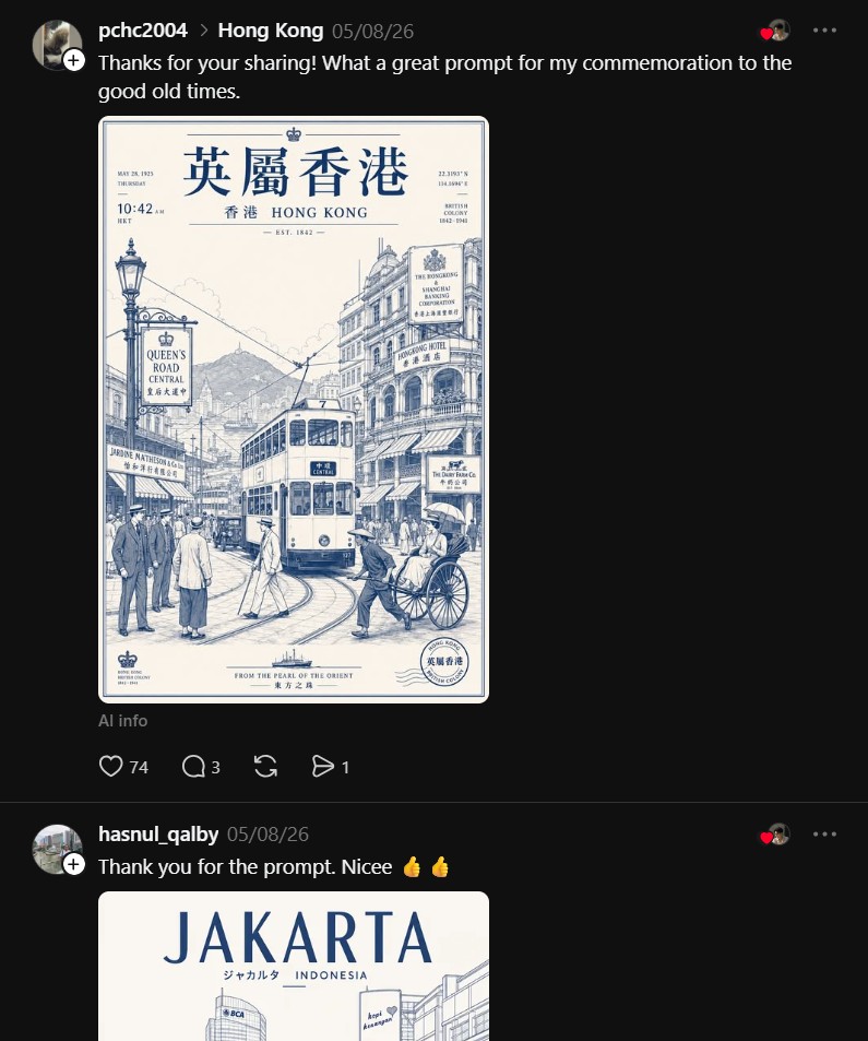
“Thanks for your sharing! What a great prompt for my commemoration to the good old times.”
@pchc2004
“Thank you for the prompt. Nicee 👍👍”
@hasnul_qalby
The “commemoration” framing is the signal. The prompt is being used for personal projects where quality matters, and the result is good enough to mark a moment. That is the bar a real design asset clears.
Most AI city poster prompts produce generic, noisy, inconsistent output because they leave composition, typography, color, and cultural detail to the model. AI Traveler K’s Beams inspired prompt, posted on Threads, is structured as a design system with explicit rules across all five layers, and the output is the clean premium editorial aesthetic that designers and marketers have been trying to ship.
If you are an AI artist, a prompt designer, a branding designer, or a marketer, the lesson is the same. The era of “describe a city and hope” is over. The era of structured, rule based prompts that produce real design assets is here.